Redesigning the Analysis Screen to Improve Clarity and Usability
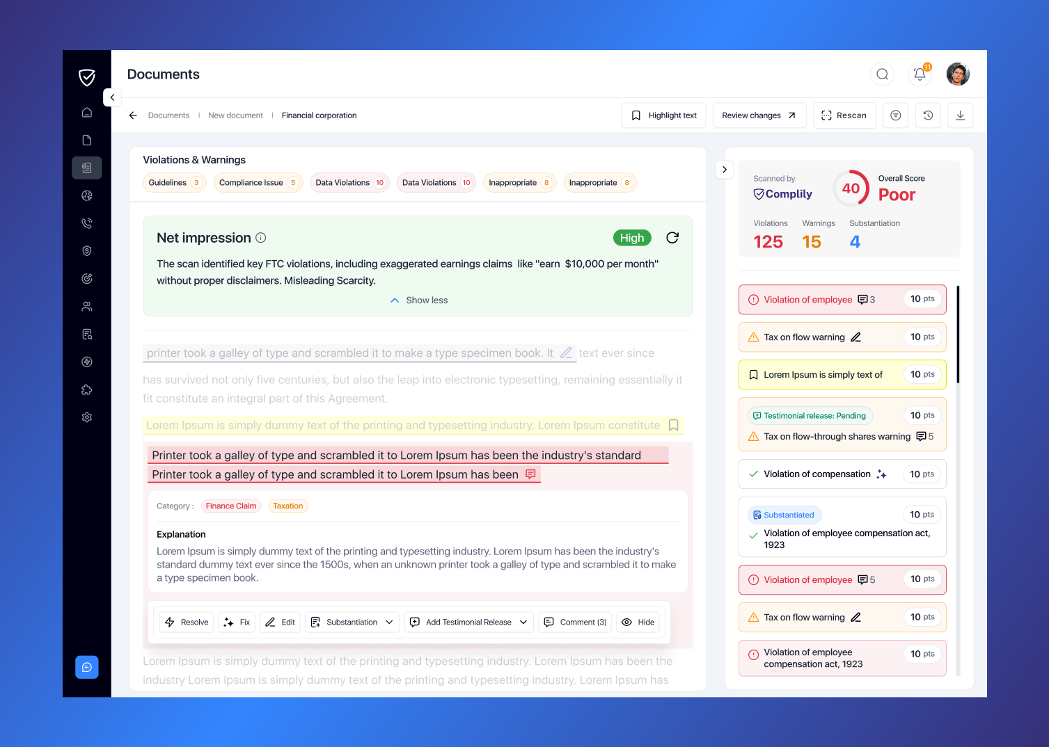
Challenge
How might we improve Complily’s analysis screen usability, addressing its cluttered interface, unclear buttons, and limited space, while maintaining core functionality for efficient issue resolution?
My role
UX Design, Visual Design,
Interaction, Prototype,
Client
Complily (an AI-powered compliance platform)
Platform
Web
Tools
Figma, Slack, Google Docs, Google Meets
Understand
Context
Complily scans documents, videos, or sales pages, flagging violations and warnings. The interface, with scores and resolution options, felt cluttered and confusing per user feedback.
Problem Definition
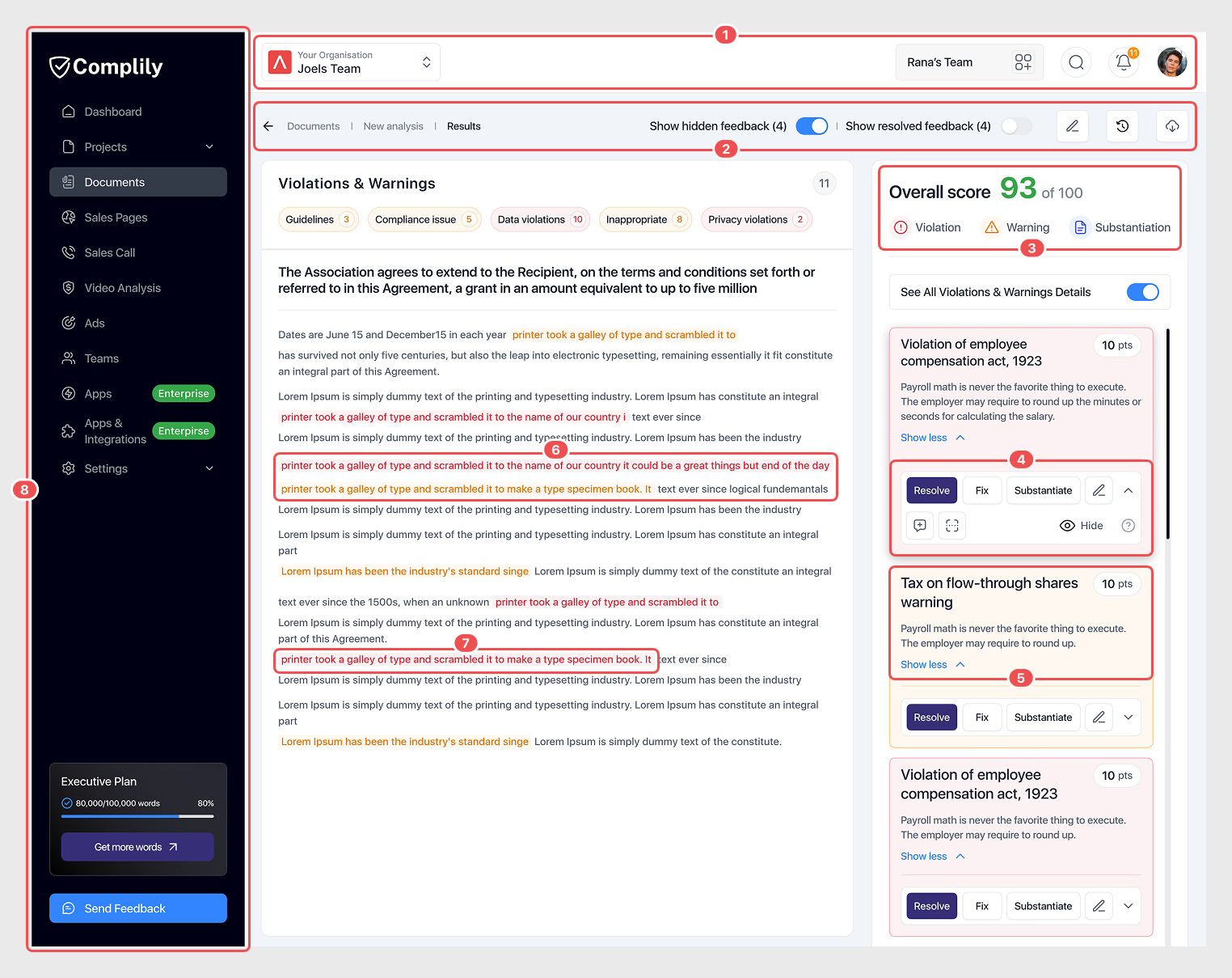
Out of many issues identified, 8 stood out as clear problems for users and the business:
🤦♂️ User Problem
Users faced cramped, confusing cards and unclear icon-only buttons, making violation and warning resolution inefficient.
💼 Business Problem
The cluttered interface reduced user engagement and efficiency, risking Complily’s retention and reputation.
Design Solution
Streamlined Top Bar Design
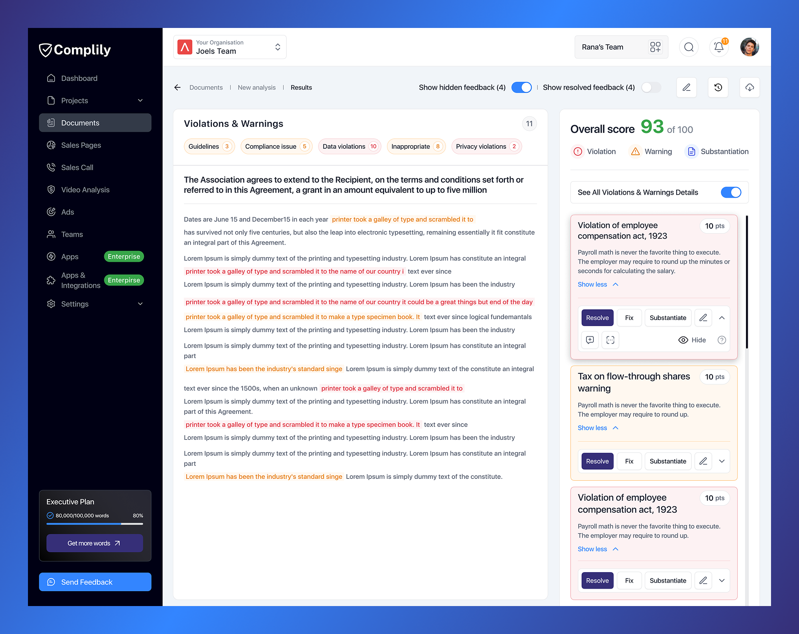
Based on user feedback, we moved the organization and team features from the top bar to the sidebar, making them more user-friendly and giving the top bar a cleaner design.

Fixed and Unified Feature Access
Actions are now grouped under one filter button for easy access, making the section cleaner. The bar stays fixed during scrolling.

Enhanced Score Clarity
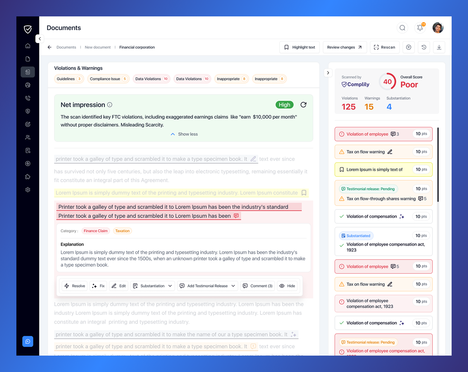
The score UI was revamped for a more realistic look, now including violation, warning, and substantiation counts.

Spacious Layout with Labeled Buttons
We moved all action features to where violations and warnings are identified, so users no longer need to go to the right-side card to take action.
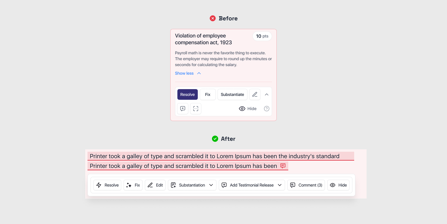
Transparent Action Tracking
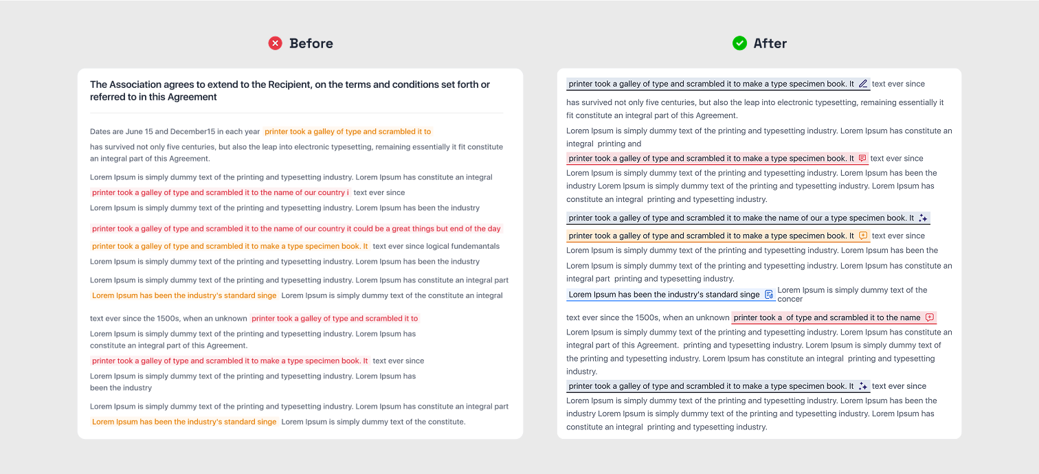
If multiple actions (e.g., Resolve, Comment, Substantiation, Testimonial Release) are applied to a violation or warning, they’re displayed on the card.
Direct Actions with Added Context
We added categories, descriptions, and explanations for violations and warnings.
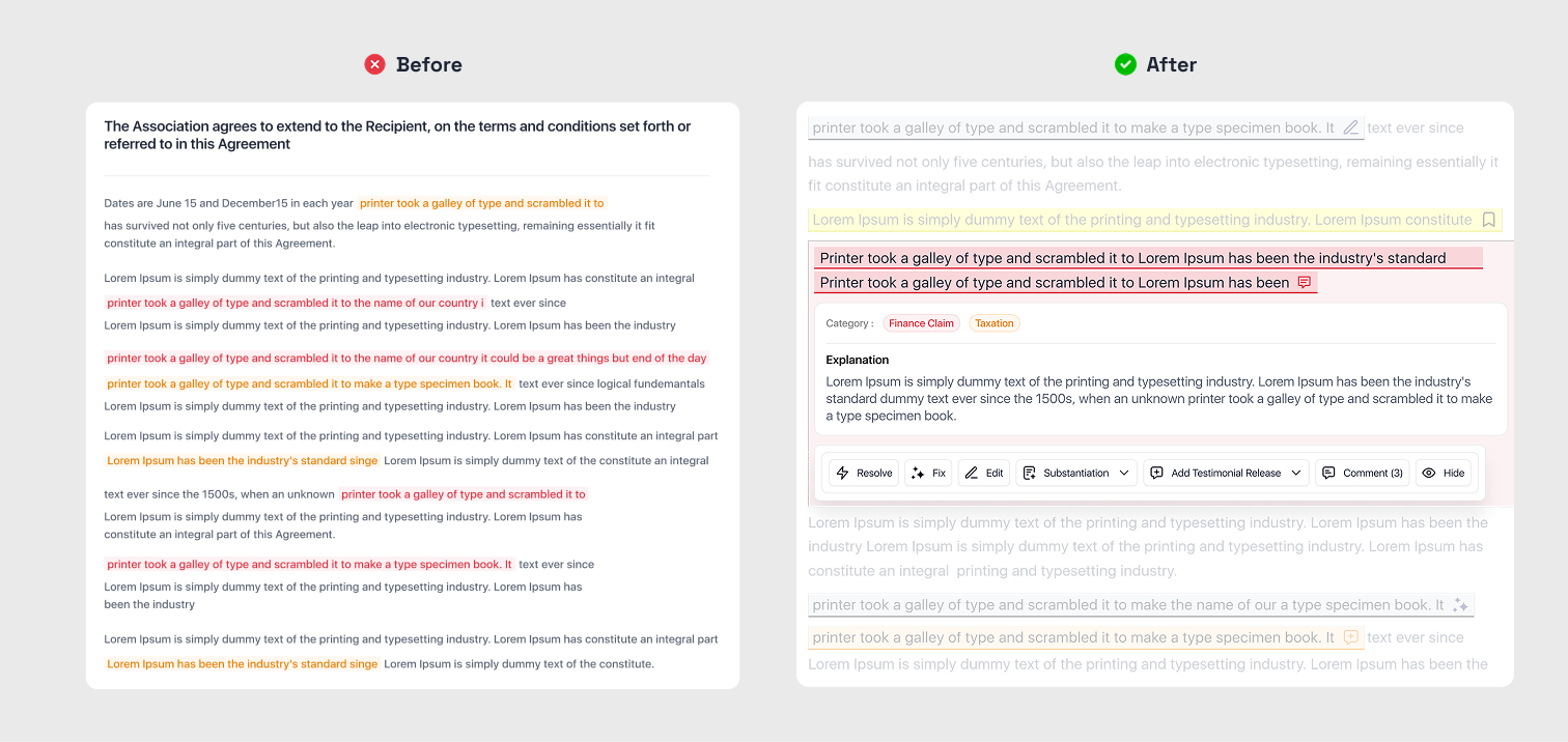
Visible Action Highlights
We added categories, descriptions, and explanations for violations and warnings.
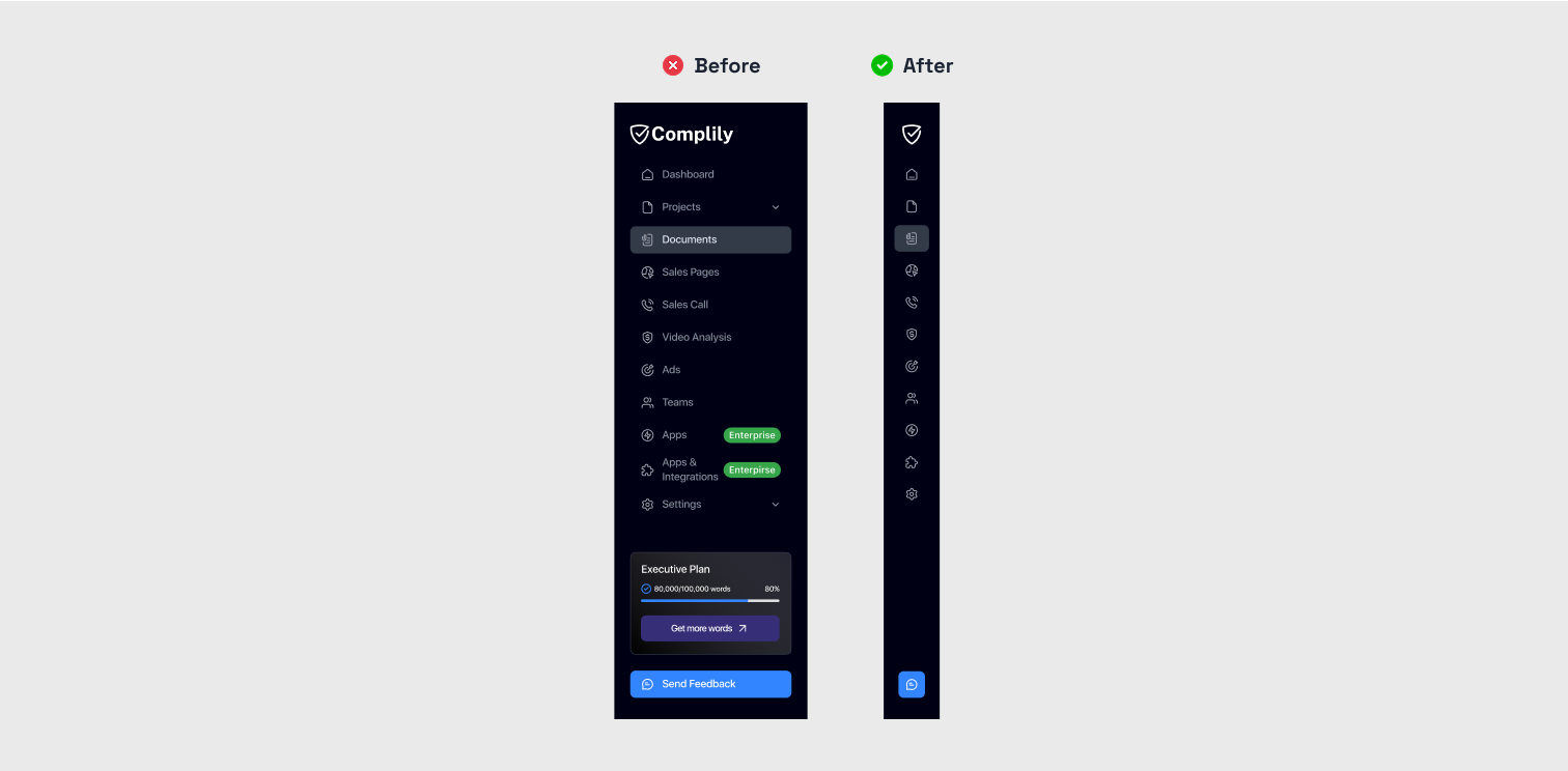
Flexible Sidebar Adjustment
We added options to minimize and maximize the sidebar. Minimizing it enlarges the screen automatically, and users can maximize it again to access sidebar features as needed.
Usability Testing
Testing Results
Tested the design with 5 sales managers to assess its efficiency

Before and After
Results

User Satisfaction Score Increased
Surveys showed a 40% satisfaction increase, with users finding the interface more intuitive and less cluttered.

Reduced Unnecessary Interactions
Relocating features and labeling buttons cut clicks and confusion, eliminating guesswork and cramped navigation.
Improved Task Efficiency
The streamlined design enabled 30% faster violation and warning resolution with direct feature access and clearer action status.

Enhanced Feature Visibility
A fixed filter button and visible bar on scroll made features accessible, reducing frustration.